
Let's Illuminate Together.
Tell us your vision. We'll craft the roadmap.
OMNITRANS

Omnitrans was winning operationally and invisible strategically. A high-performing company in freight, logistics, transportation, and customs brokerage, surrounded by competitors that look interchangeable, sound identical, and compete on price.
Across the logistics and supply chain industry, perception is often overlooked. Brands default to corporate visuals, generic messaging, and safe positioning.
As Omnitrans set out to expand into new markets, the risk was clear:
“If you look like everyone else, you get chosen like everyone else.”
And that leads straight to price pressure.
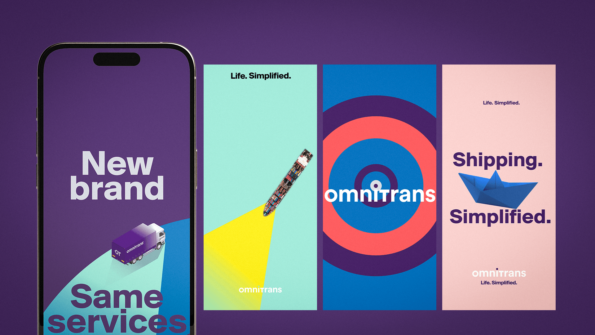
This was not about refreshing the brand. It was about building a presence strong enough to command attention, differentiate in the logistics market, and support long-term growth.
Most logistics, freight, and transportation companies try to look more “professional”. The result is predictable. Safe. Forgettable.
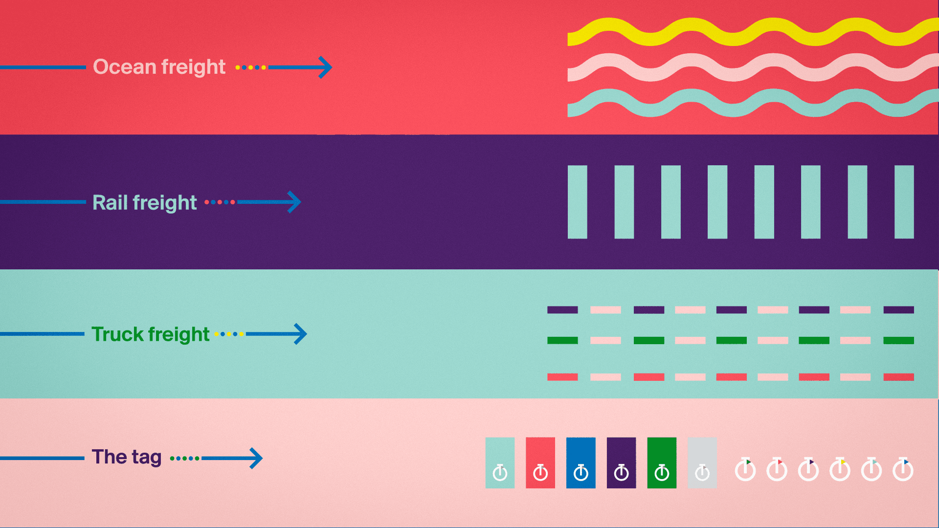
We saw something else. Global shipping and logistics are built on movement, precision, and interconnected systems.
Ocean freight. Trucking. Rail freight. Air cargo. Real-time tracking.
Flows. Directions. Signals. Networks.
The issue was never the industry.
It was how poorly it had been expressed.
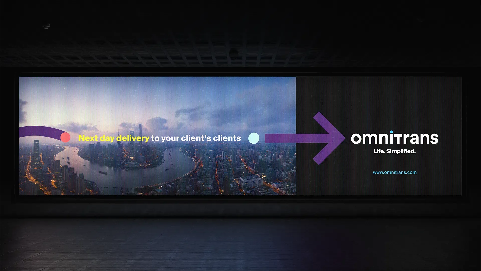
The opportunity was to take these raw elements and** turn them into a distinctive brand language rooted in the reality of logistics.**
Create a brand system built directly from the mechanics of global movement.
Not inspired by logistics. Built from it.
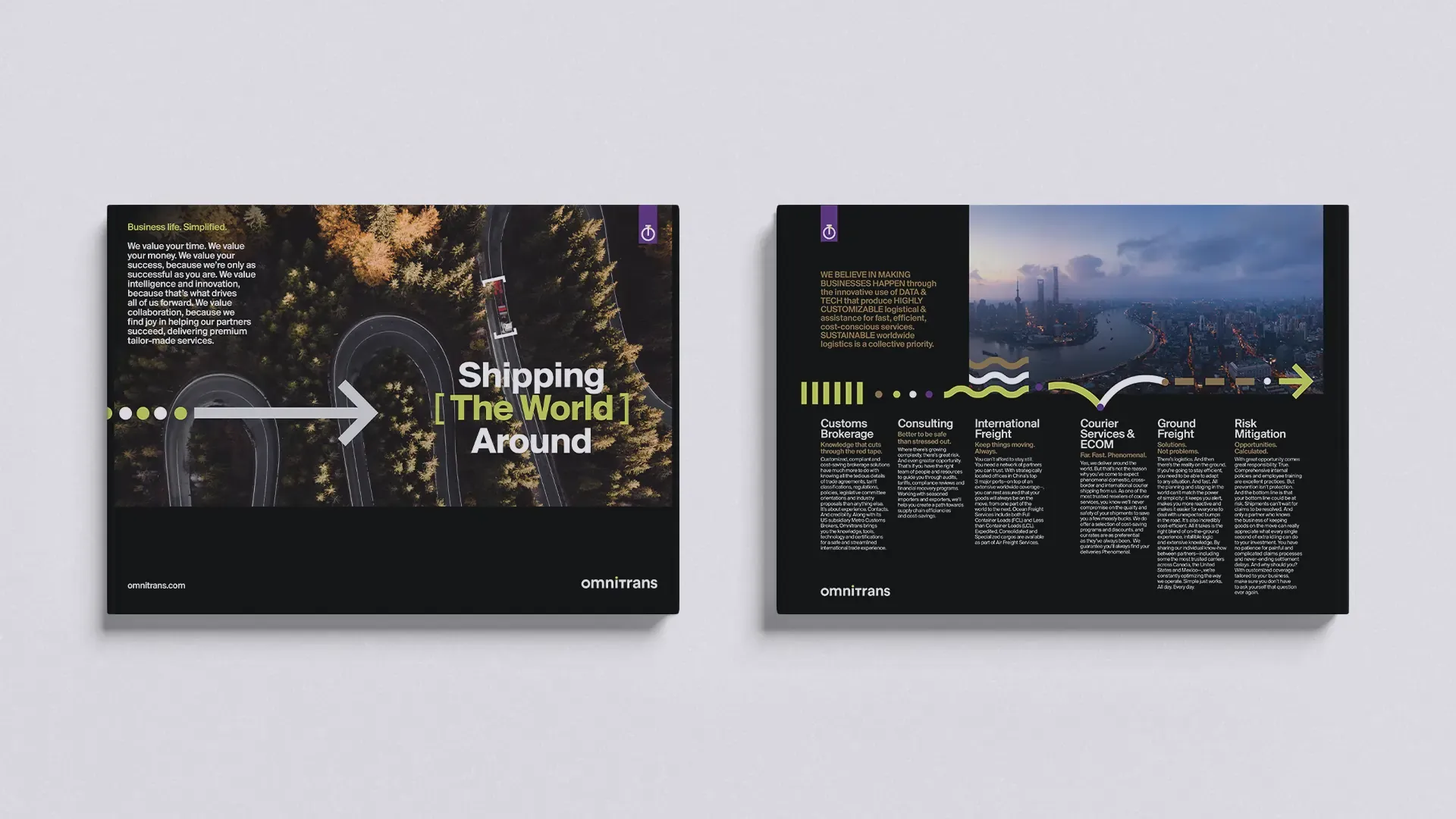
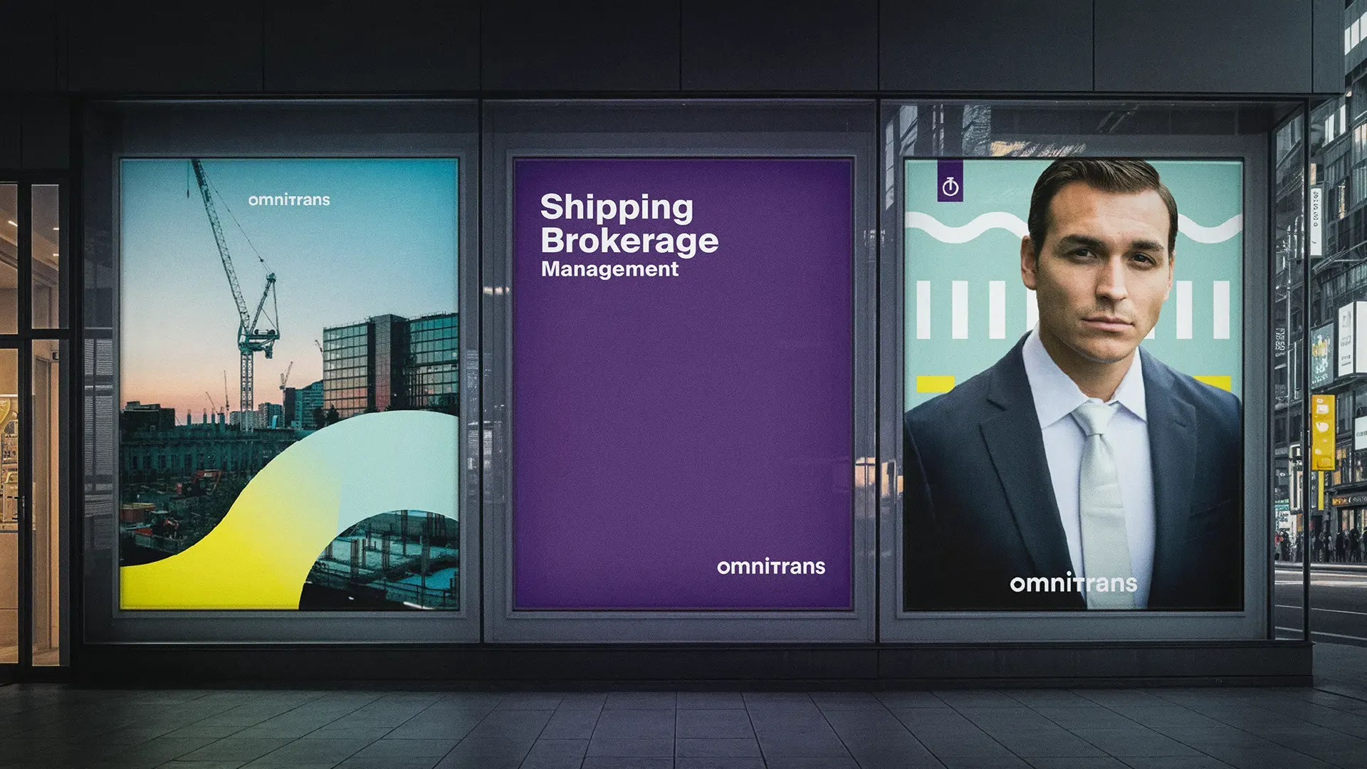
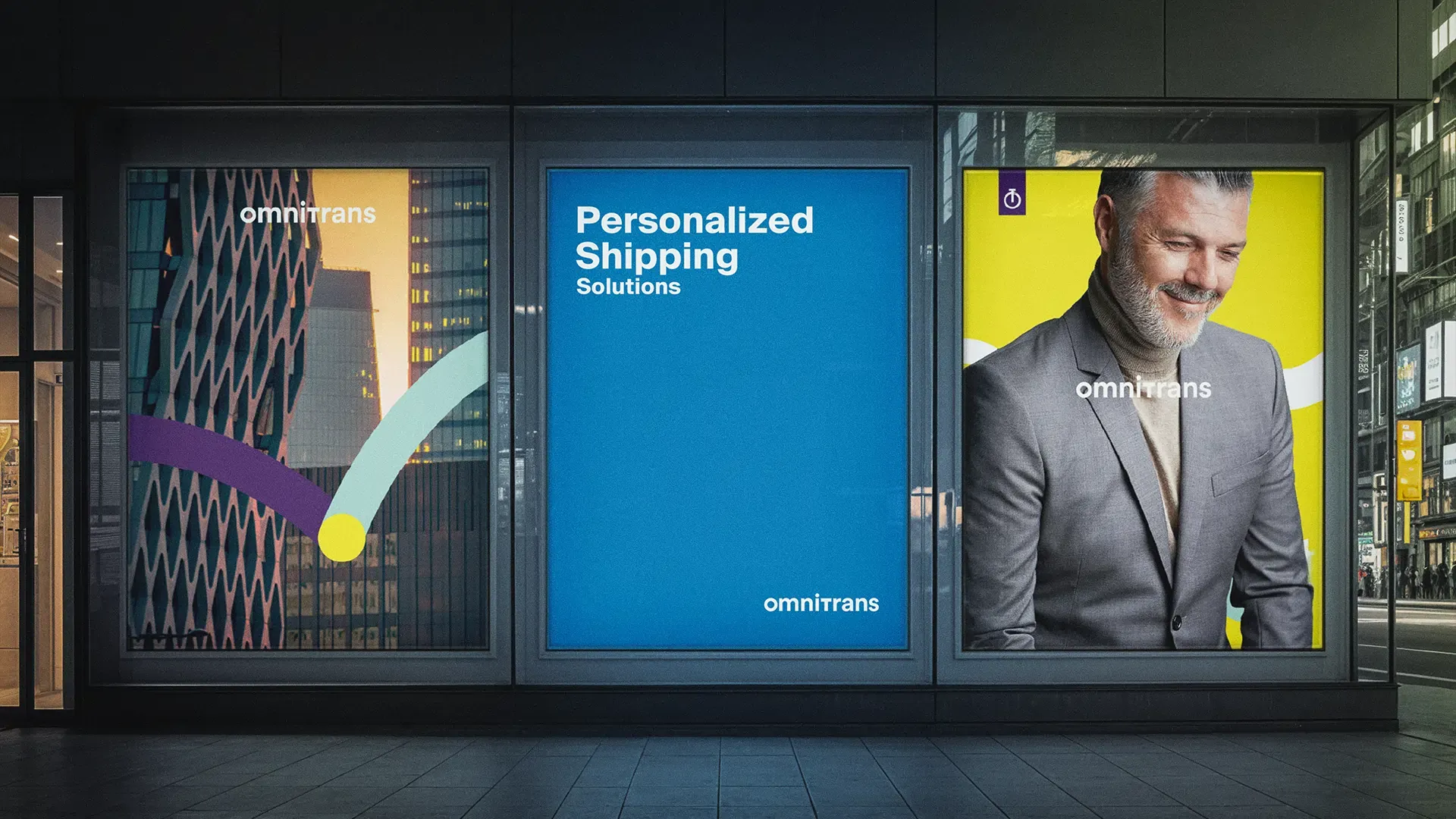
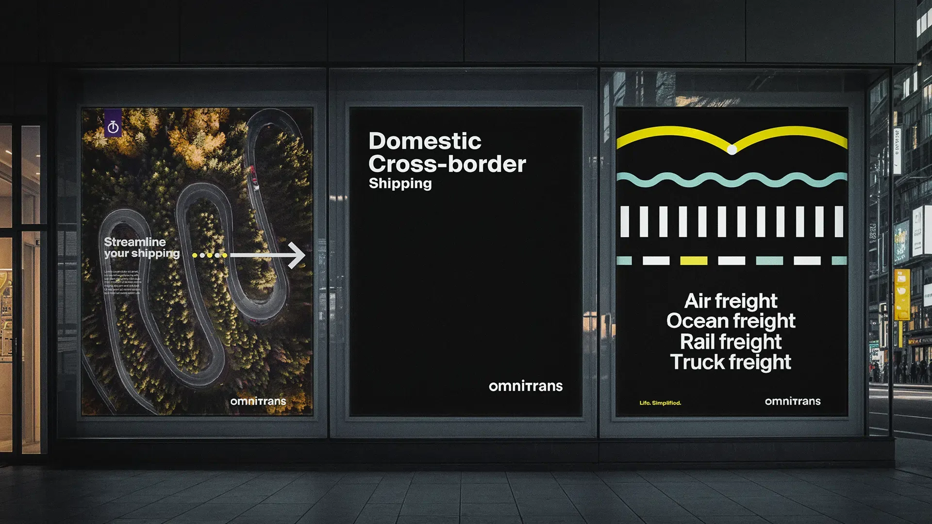
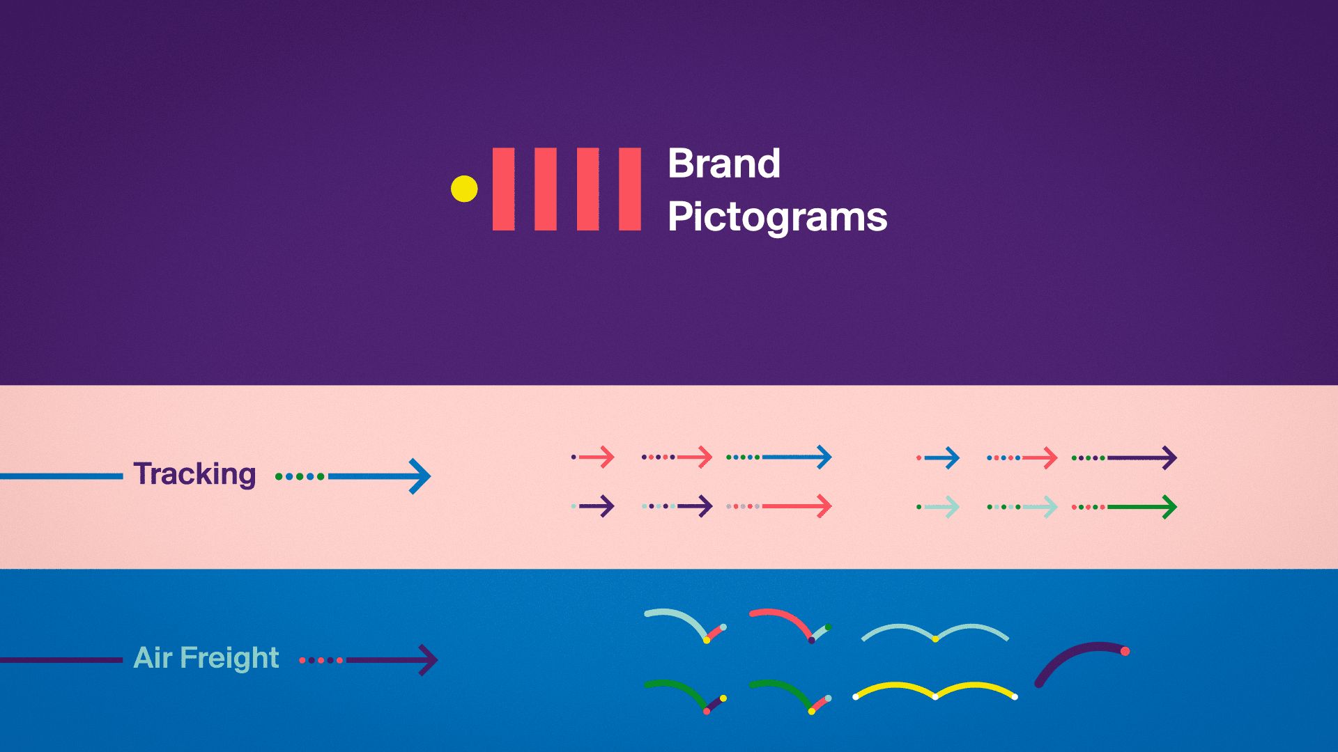
We transformed the core elements of freight, transportation, and supply chain operations into a proprietary visual language that is both functional and expressive.
Every visual element carries meaning. Every shape serves a purpose. Every asset connects to a larger system.
**We take the same fundamentals every competitor relies on and transform them into a distinctive, ownable brand system.
**
The ambition: turn basic industry codes into a premium, expressive, and impossible-to-ignore brand language.


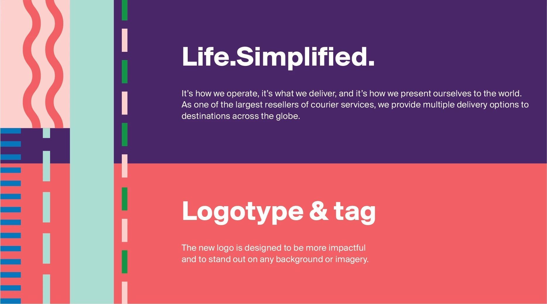
We designed a living, modular brand identity rooted in the core services of the business: